Using Divvy for rapid testing of Responsive Design
Like many others I’m getting quite into this responsive design malarkey and working with media queries has completely changed how I approach creating my CSS files for a website.
Whilst there is no substitute for testing on actual devices and we should exercise caution at designing for predetermined breakpoints, I’ve found having a quick way of checking a design at different viewports on my Mac has massively helped me working on responsive website designs.
I’m a big fan of Divvy (also available on Windows) which provides a quick tool for resizing windows to predefined sizes on a 6×9 grid. The nice thing with Divvy is that you can set keyboard shortcuts for pre-defined blocks.
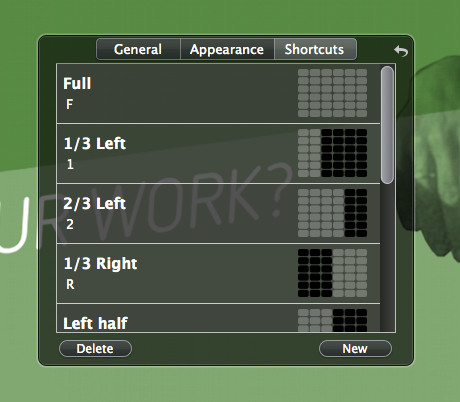
When working on media queries in my CSS Divvy has become an invaluable part of my testing process. I’ve got a keyboard shortcut for Divvy mapped to ⌘⇧D and I’ve set a range of common jump points which on my 1440 × 900 13” Macbook Air works out as:
- i (iPhone-ish) = 1/6th (240px)
- 1 = 1/3rd (480px)
- L (Left half) = 1/2 (720px)
- 2 = 2/3rd (960px)
- F (Fullscreen) = Full (1440px)
This is pretty great for testing against a broad range of device widths – mobile, 480px and above, 768px and above and 1024px and above – and whilst nothing beats testing on actual devices I’ve personally found Divvy to be an invaluable way to rapidly test responsive designs at a range of viewport widths.
Comments
I adore Divvy, and hardly ever resize by using the manual way anymore. Thanks for the tip!
It’d be great if divvy could customize width and height settings in pixels.
Cole,
bit late to the party on this one – but what an excellent little tool :-)
Thanks for this ;)